A total brand refresh and new website

- Solutions Brand refresh and new website
- Technologies Adobe Photoshop, Adobe Illustrator, Webflow
- Country Isle of Man
Introduction
Greenwave is an accountancy firm on the Isle of Man. Founded in 2012 by an accountant with boundless enthusiasm for new businesses, over time the company has become an invaluable resource in the Man startup community.
Their website and branding, however, didn’t reflect their expertise or the personality of the company. Plus, the site was built using now-obsolete technology, opening the doors to future problems. Greenwave engaged Curbsy to do a full brand refresh and build a new website using modern technology.
Project Duration
2 months, part-time
Team
1 developer
1 designer
1 project manager
Project Description
The Greenwave owners wanted their new branding to convey their company ethos. This is a company with a strong personality. The team often works late hours and weekends towards their goals of seeing their clients succeed. Conversely, they wished to ward off anyone looking for Ye Olde Accountancy Firm, and instead target entrepreneurs.
The primary description given to us was “quirky”. So our first task in this was understanding completely what this meant to them, as quirky covers a lot of ground in design.
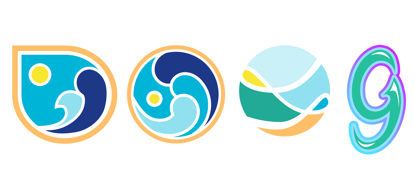
We started with the logo. Our first set was intended to flush out what they liked and what they didn’t. We brought in abstract waves, sun and shore, then went outside our usual design aesthetic to test the boundaries with a fat, glossy G.

The feedback was that the concepts should be merged. Use the G, but add waves. They also wanted the green from their previous branding to be used.
The next set brought the waves into a G shape and incorporated the green.
We also included our favourite from the previous set with the green. Of these three, the middle option was chosen, with a request to remove the sun and work further on the colours.


With a shape inspired by the Fibonacci sequence and colours from nature, the Greenwave logo reached final approval.

The rest of the website then began to take form.
Visit the finished Greenwave website at greenwave.im.
Results
We’re so chuffed about the new website, we’re getting amazing feedback from our clients about it. We couldn’t be happier with the design process and our new website.
Pauline Smith, founder of Greenwave.